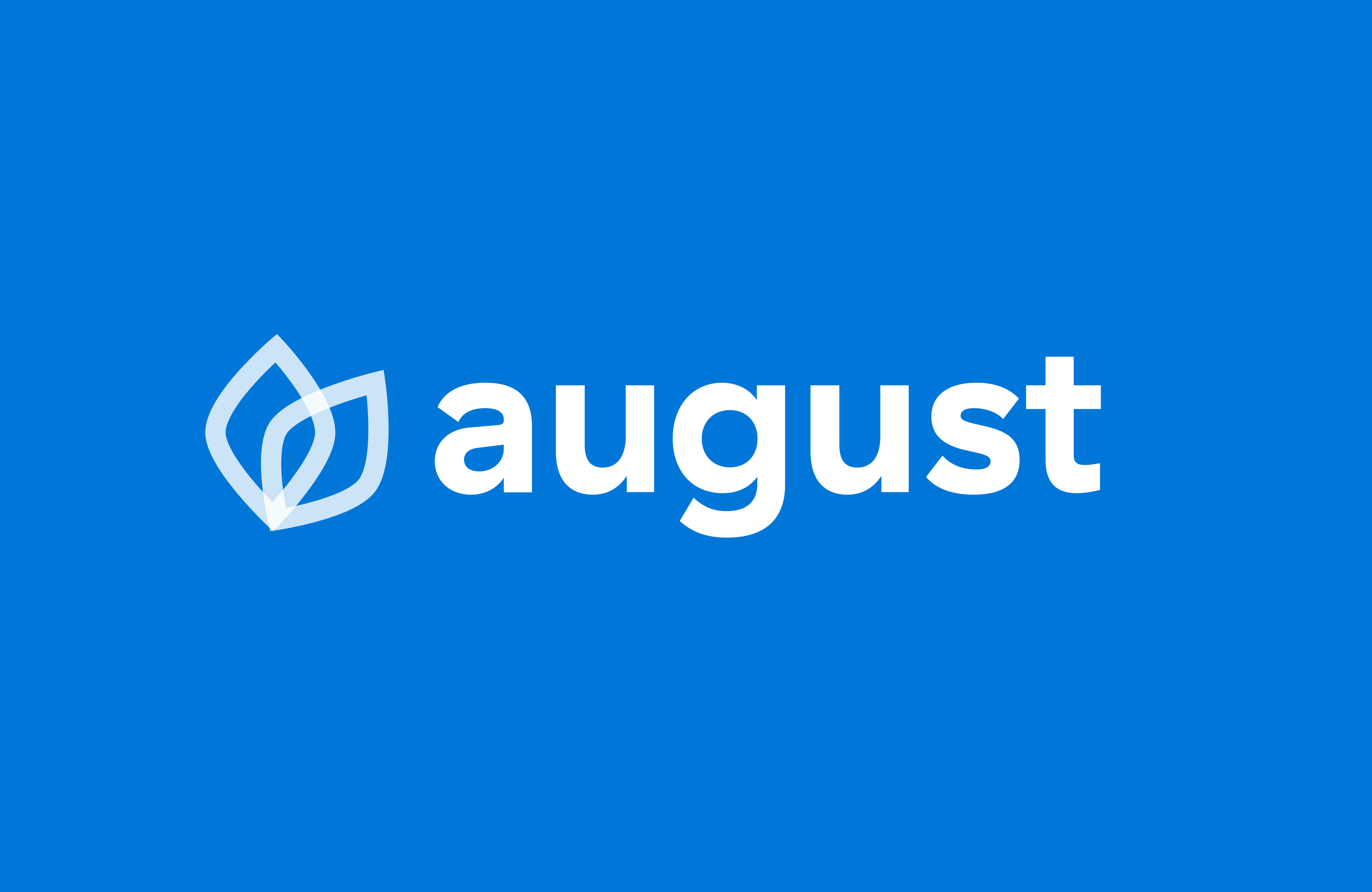
August
Services
- Visual Identity
- UI Design
Team
- Kyle Andelin (Co-Founder)
- Tad Rosenberg (Co-Founder)
Platform
Website
From Farmhand to August
August was in the process of renaming and rebranding their product. The project involved developing a new visual identity and brand guidelines, then applying the fresh look to their existing app with minimal structural changes.
The Old Brand
Farmhand was a functional product with real potential. The rebranding process started by identifying where the biggest opportunities for improvement were.
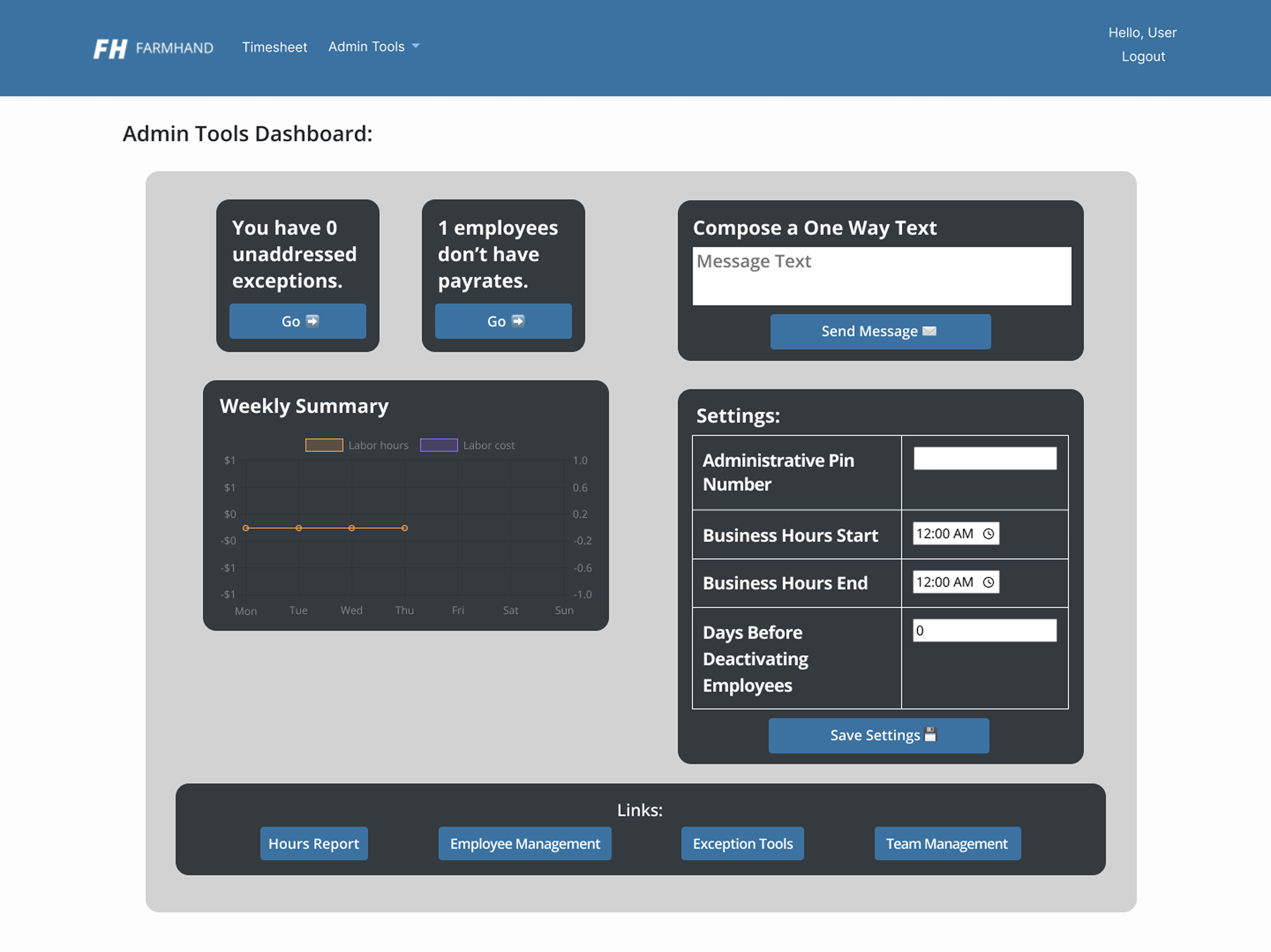
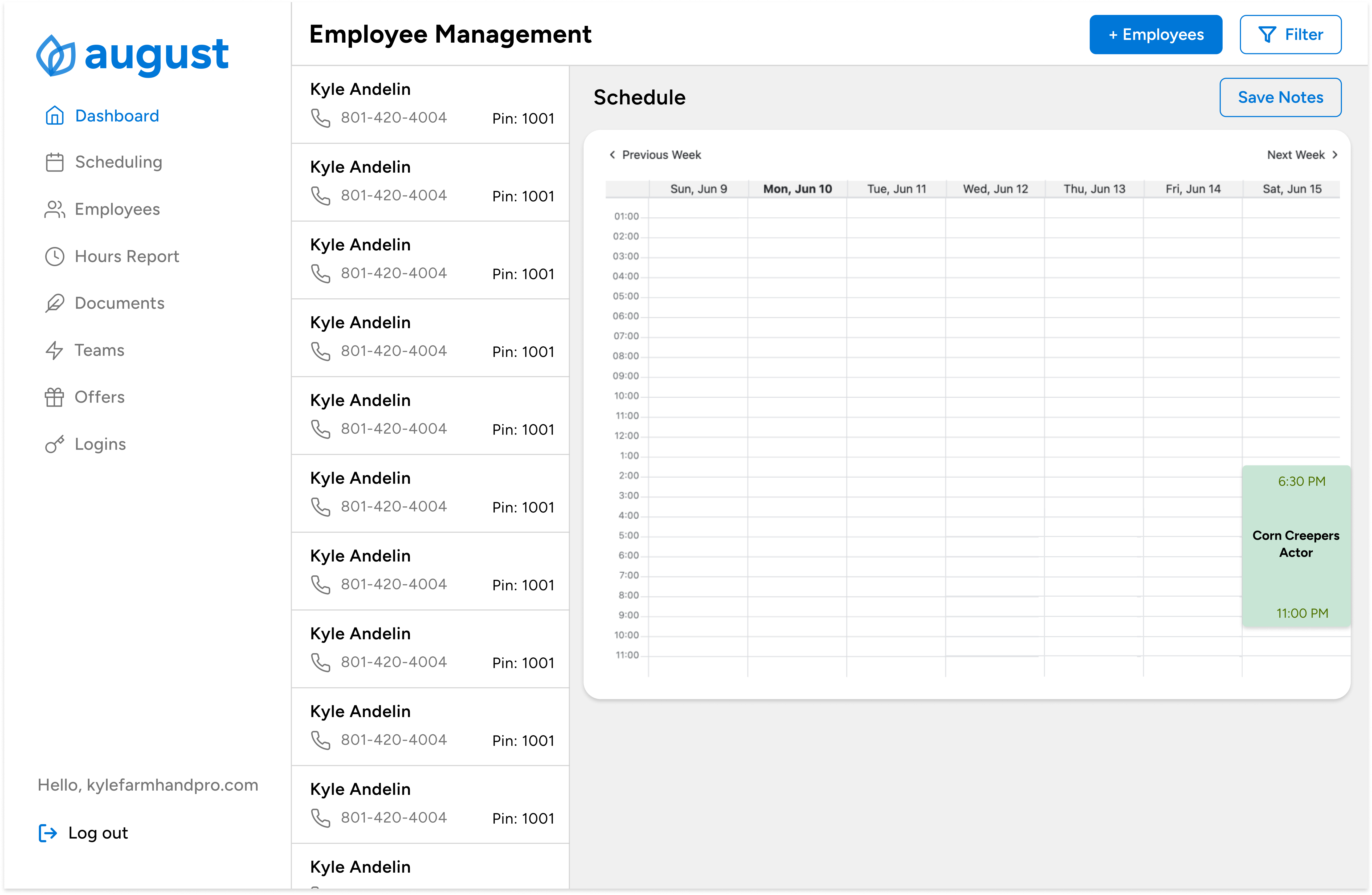
Admin Dashboard
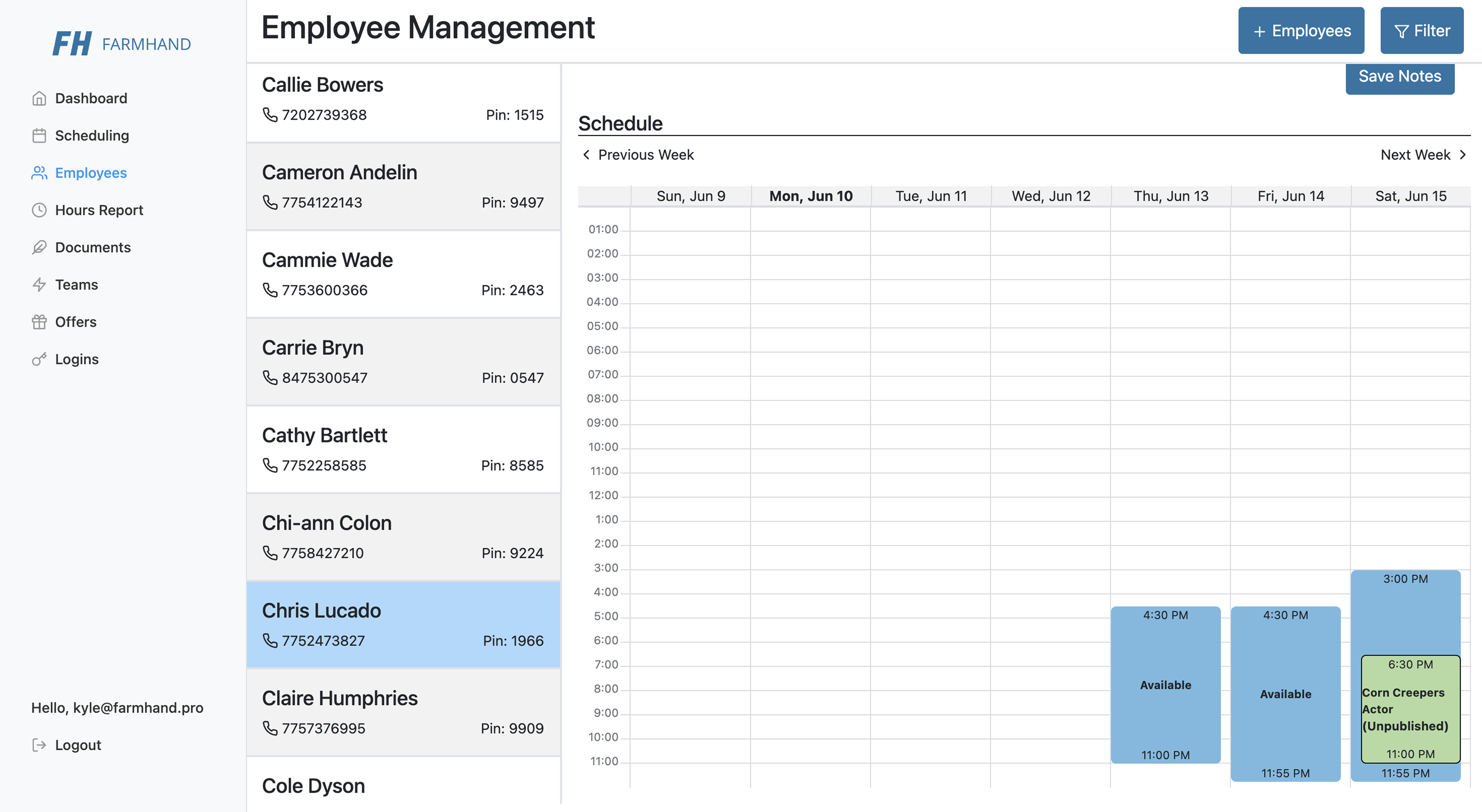
Employee Management
Opportunity to establish a brand identity
The existing FH mark was functional but lacked the personality and recognition needed to stand out in the HR software space.
Room to improve visual clarity
The dark interface made information harder to scan and digest quickly for everyday users.
A chance to build consistency
Without a shared design system, components varied across the product making the experience feel disconnected.
Simplifying information density
Layouts had room to breathe more, making key actions easier to find and reducing cognitive load.
The New Direction
August wanted a brand that felt modern and credible for HR professionals, clean, approachable, and built for everyday use. The design direction was inspired by Airbnb, moving away from the heavy feel of typical workforce software.
Logo
The August logo is inspired by the lotus flower, a symbol of growth, transformation, and rising above challenges. The two petal shapes also represent the pairing of seasonal and year-long employees, reflecting the core of what August is built for.
Primary
Secondary
App Icon
Color Palette
A confident primary blue anchors the brand. Semantic colors handle status states across the app, keeping the interface clear and easy to scan.
Primary
#0077D8
Primary Blue
Secondary
#CA4748
Red
#FFEDB8
Yellow Light
#735A0E
Yellow Dark
#C8E5D5
Green Light
#4E7201
Green Dark
#F5D5D5
Red (20%)
#D0E4F5
Primary (25%)
#FFC266
Orange (70%)
Neutrals
#F0F0F0
Grey Light
#FFFFFF
White
Typography
GT Haptik Bold is used for the logo. Figtree is the app typeface, modern, clean, and highly legible at all sizes.
Buttons
Button styles used across the app for primary actions, secondary actions, and destructive actions.
Tags
Status tags communicate employee and shift states at a glance.
Icons
This project uses Feather Icons, a clean, open-source icon set that matches the minimal, modern feel of the August brand.
This project uses Feather Icons, an open-source icon library that matches the clean, minimal feel of the August brand.
View the full library →Next Project
Brevium
Web Design