TripFlex
Services
- UI/UX Design
- Mobile Design
- Web Design
- Prototyping
Team
- TripFlex Team (Founders)
Platform
Web & Mobile App
The Brief
TripFlex is an offline-first travel planning experience that allows users to organize and access trips without relying on connectivity. Working in a team of four, I led the product design across web and mobile and contributed to the development of both the website and Android app. The goal was to simplify travel planning workflows while delivering a cohesive, modern design system.
Web & Mobile Experience
Designing a seamless trip planning experience across devices.
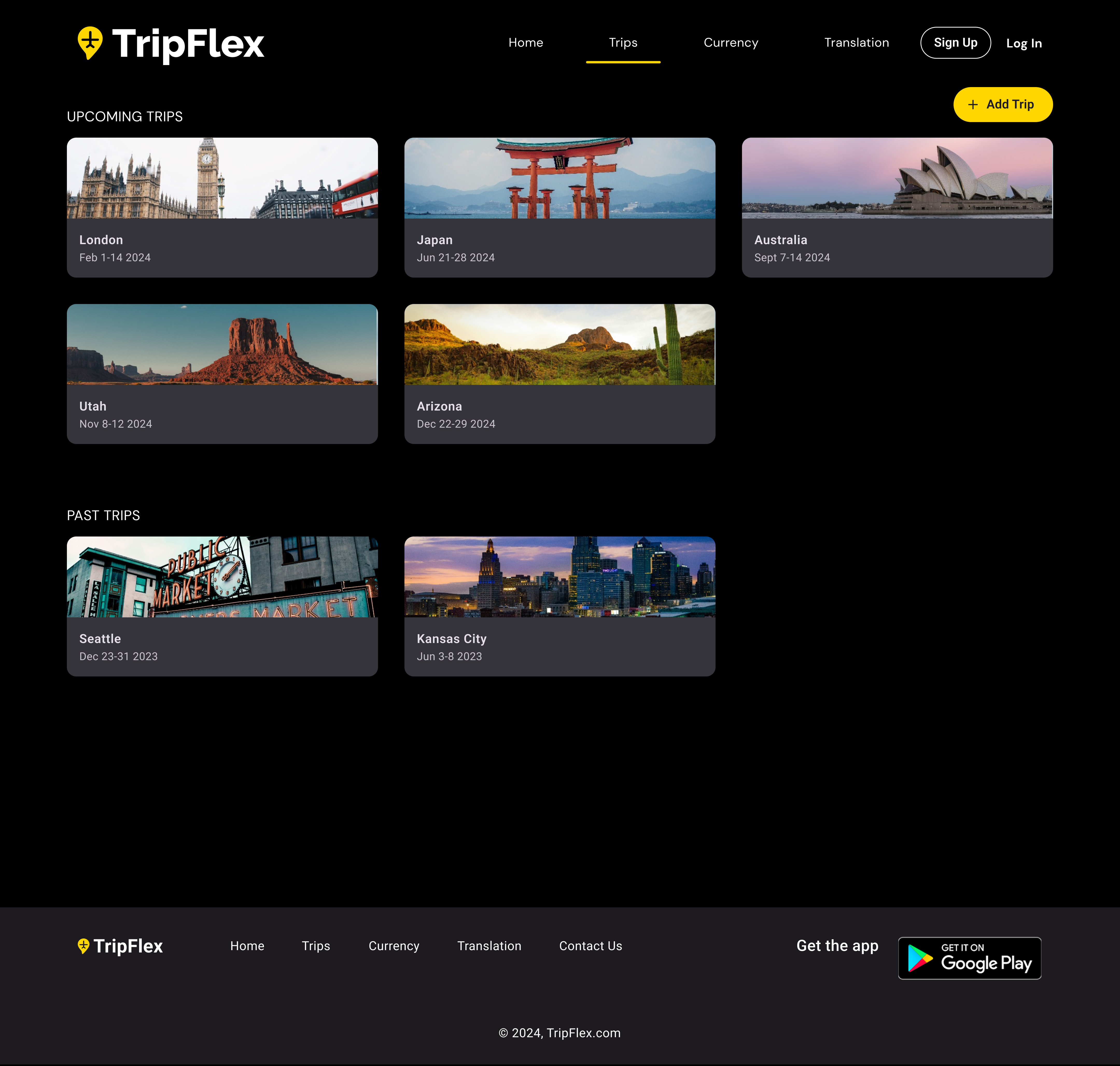
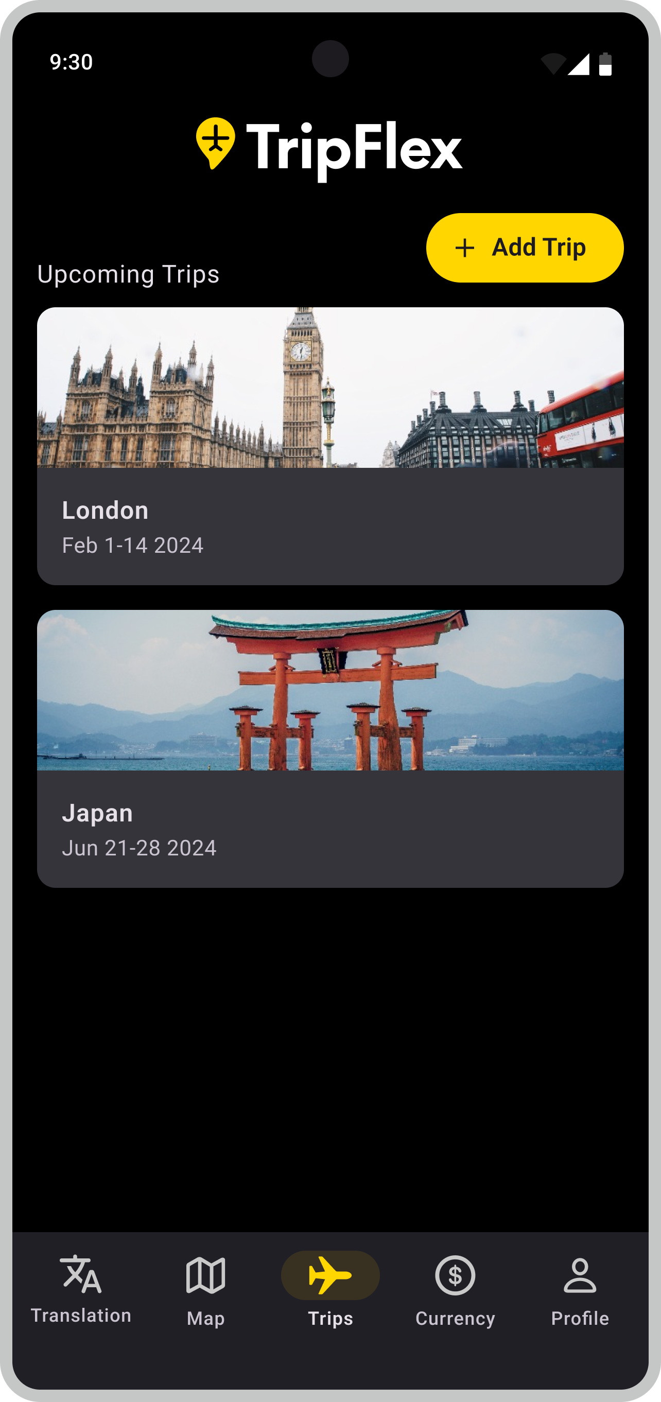
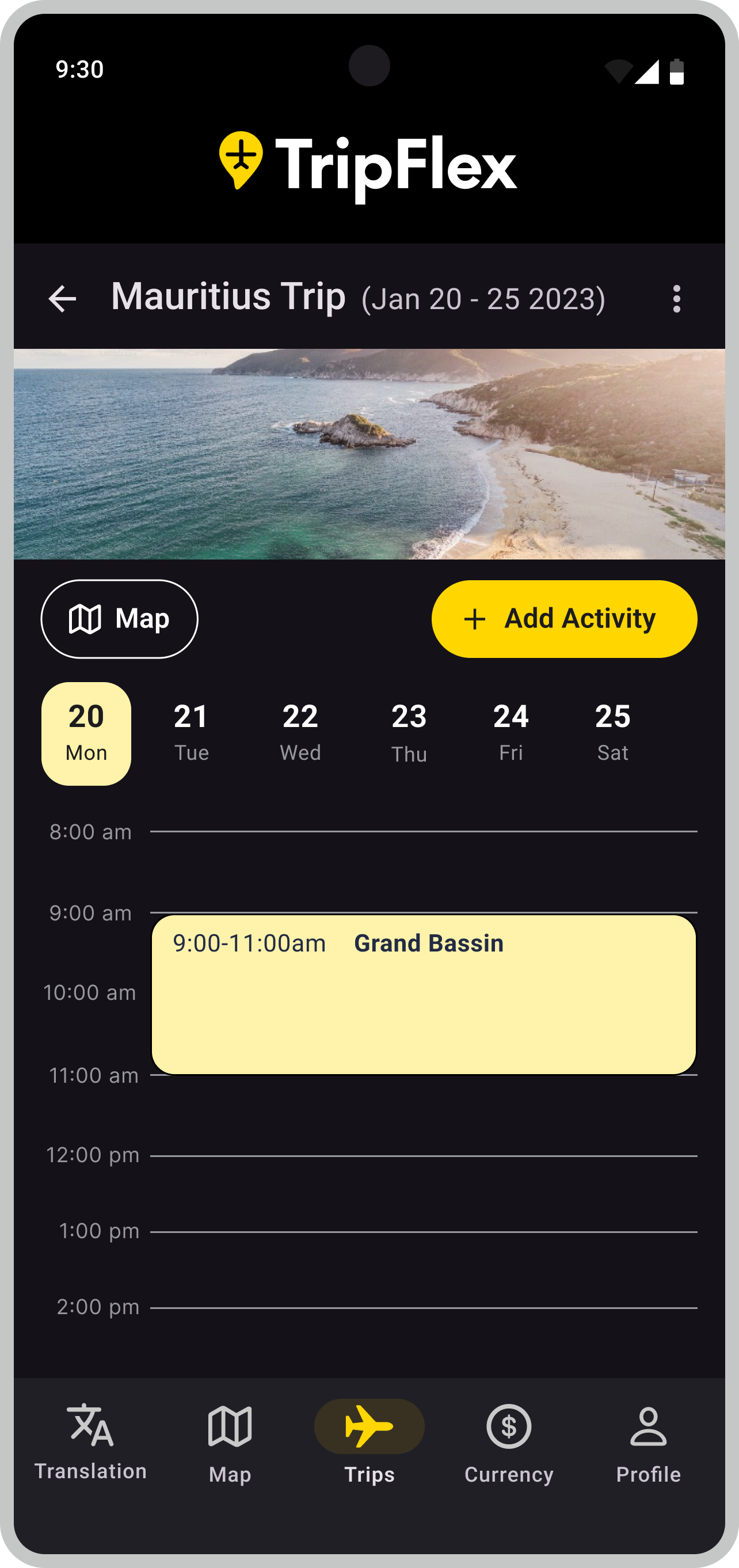
Trips Dashboard
A centralized view of upcoming and past trips, designed for clarity and quick access.
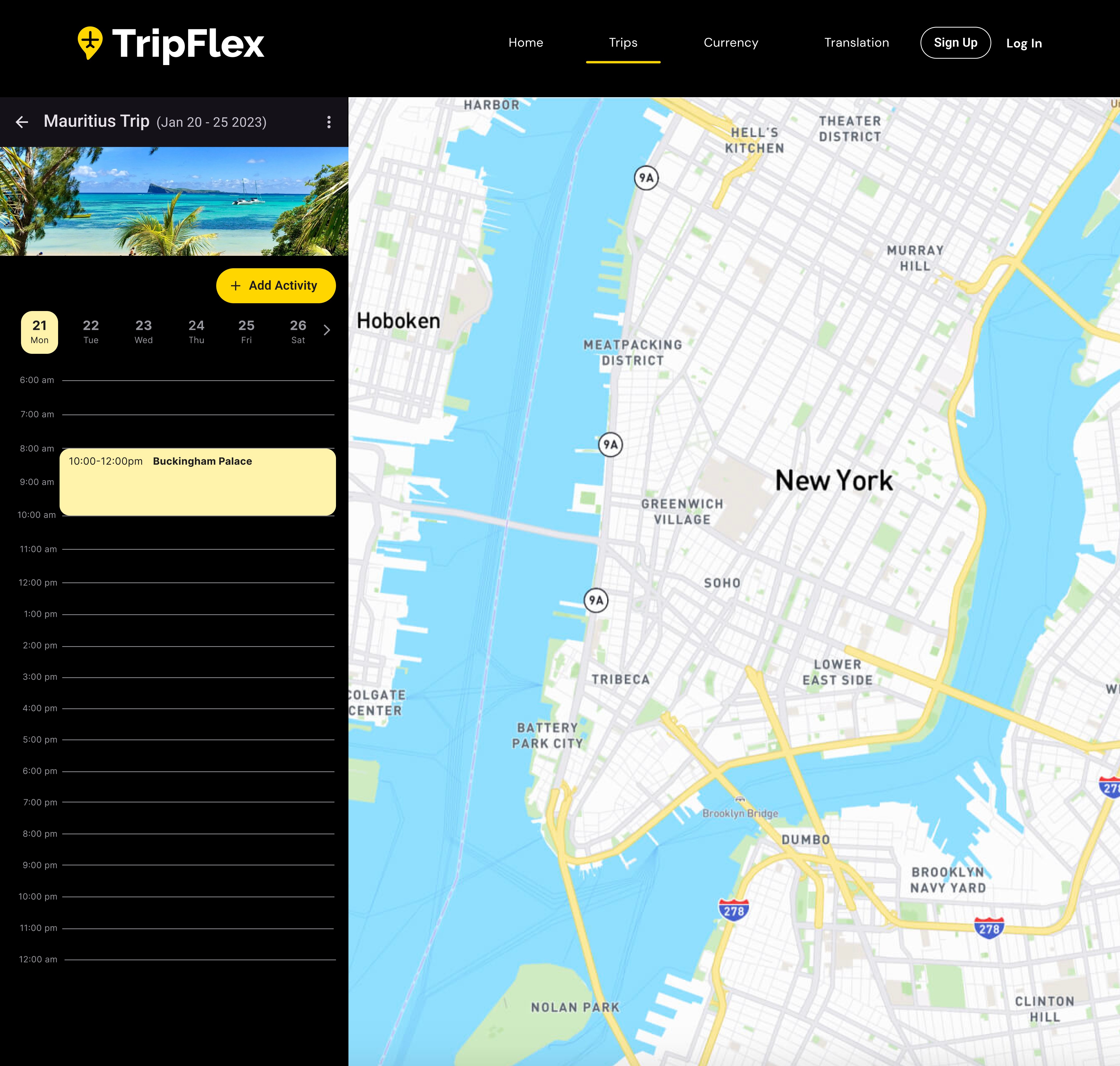
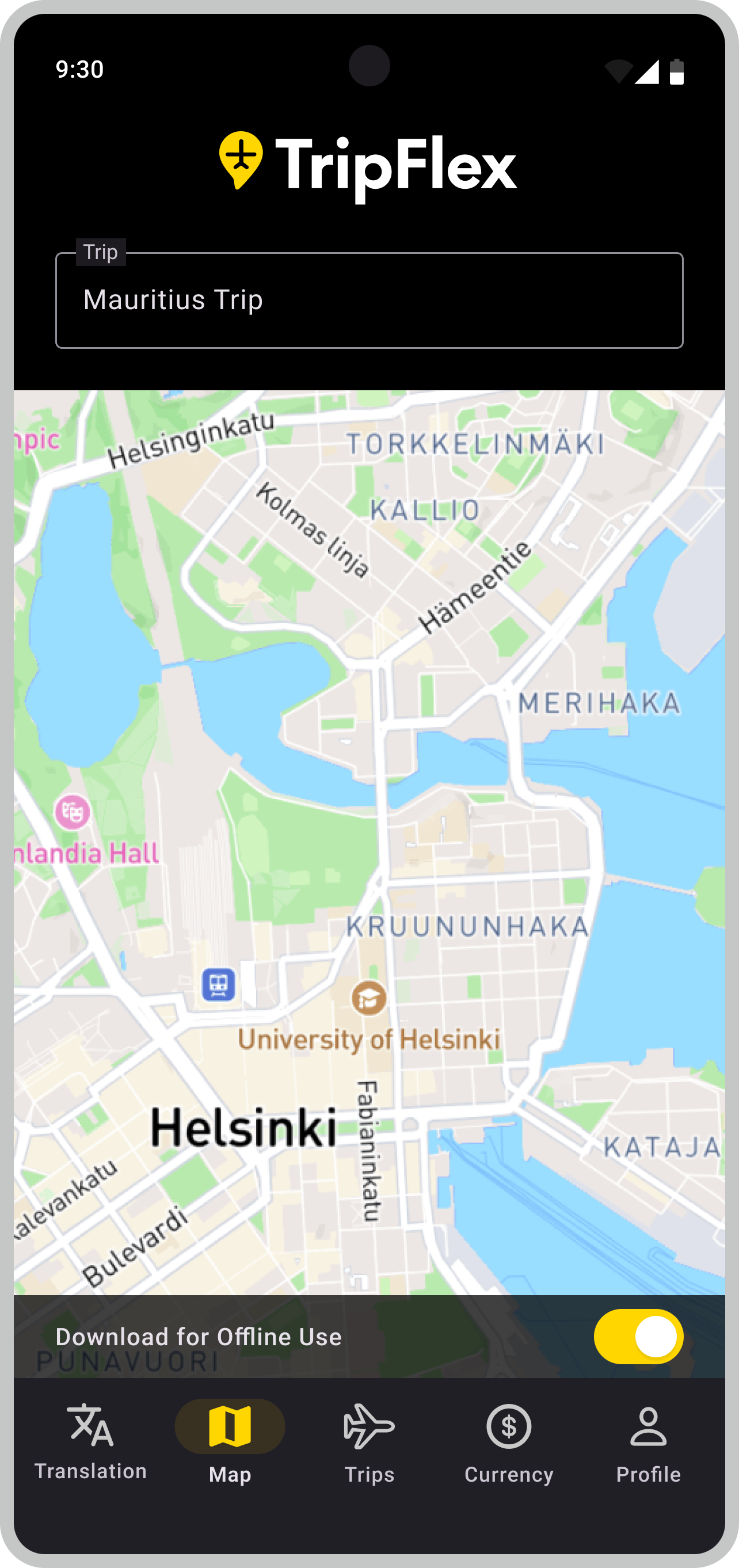
Map & Itinerary
A visual planning experience that combines location context with daily scheduling.
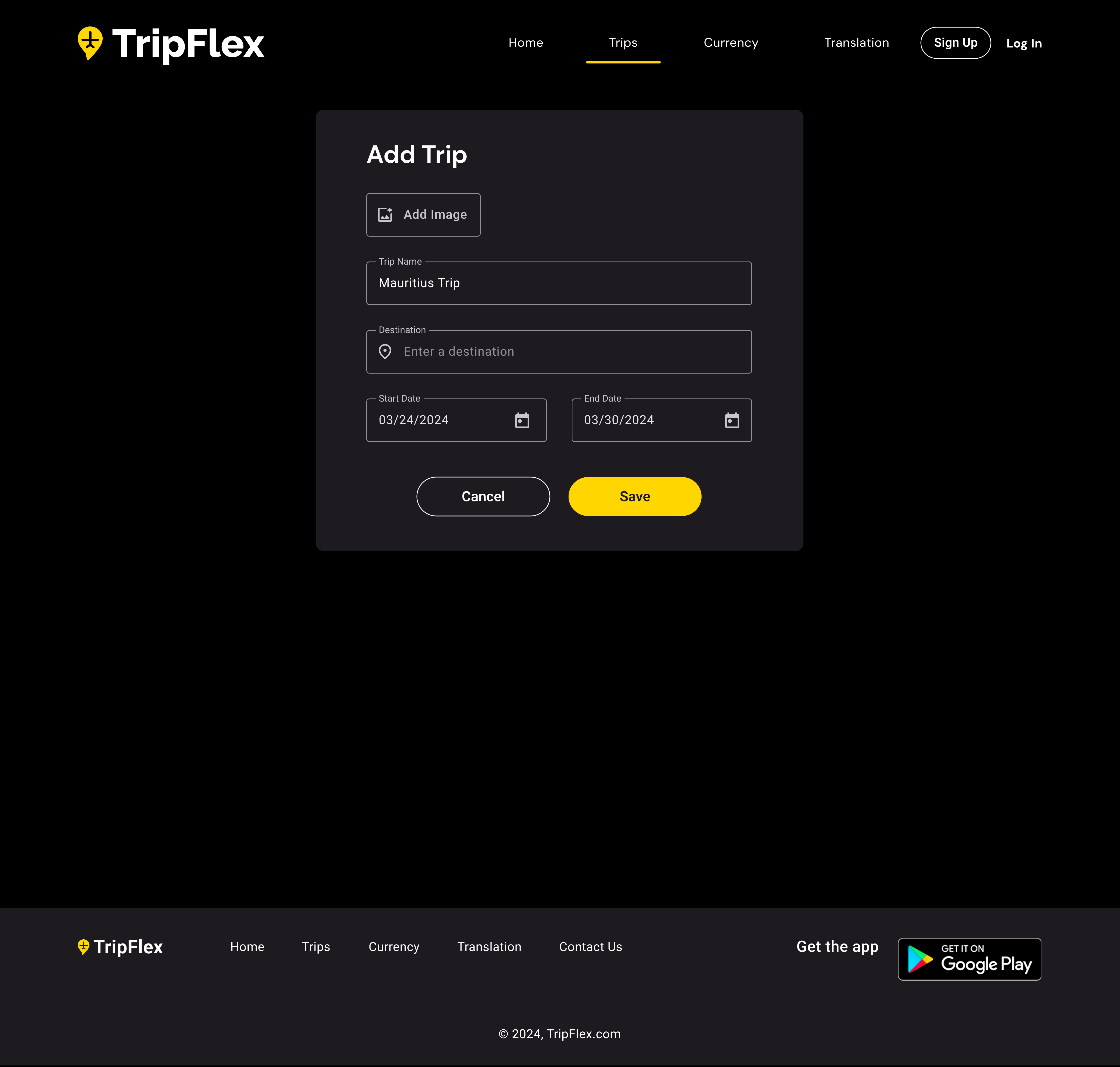
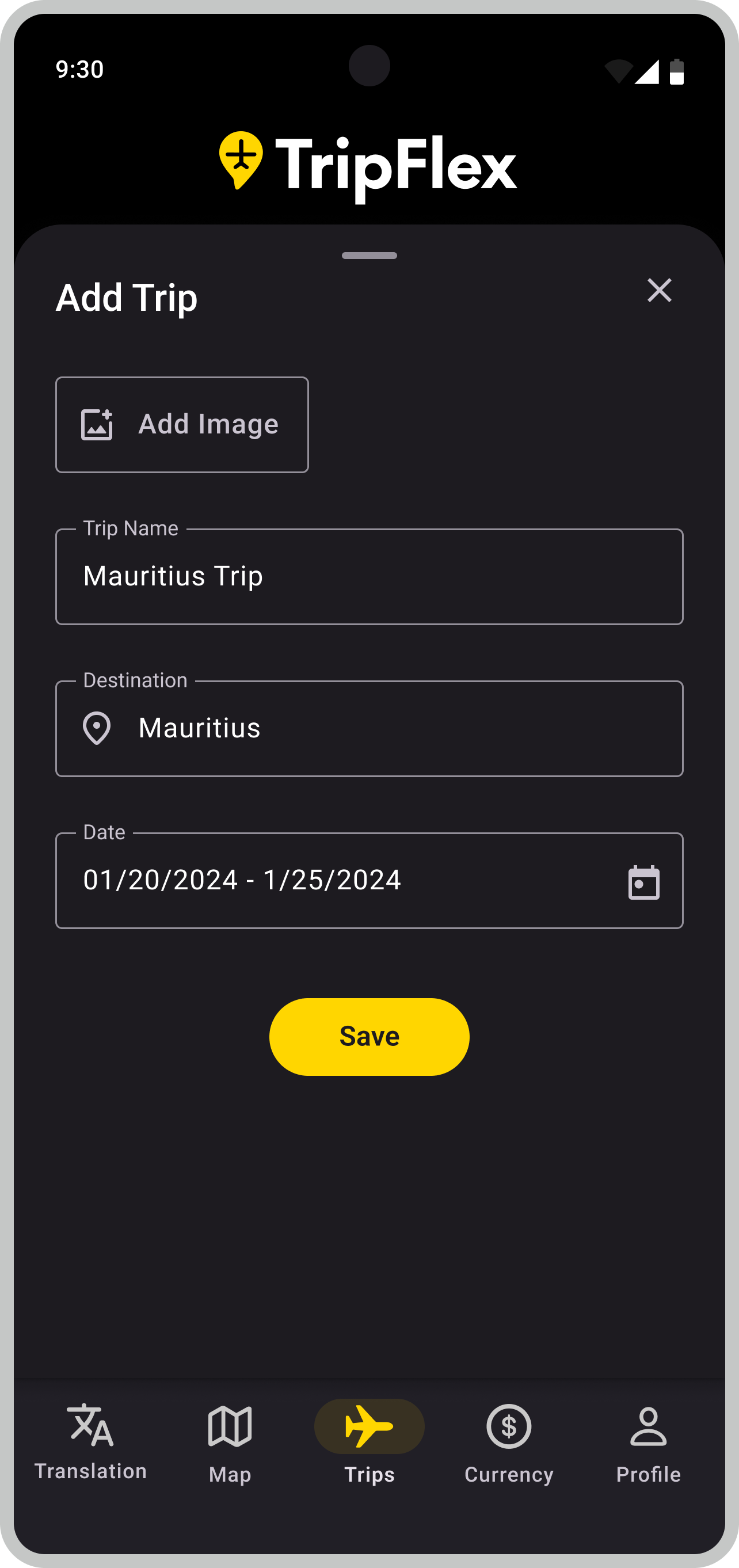
Create a Trip
A streamlined flow for adding and organizing new travel plans.
Brand Guidelines
TripFlex Brand System
A bold, high-contrast brand built for travelers. Dark backgrounds with a striking yellow accent create an energetic, modern feel that works across both the mobile app and website.
Logo
The TripFlex wordmark pairs a yellow location pin icon with clean white type. Designed exclusively for dark backgrounds to maintain contrast and visual impact.
Primary
Color Palette
Yellow is the hero of the TripFlex brand, used sparingly against dark backgrounds for maximum impact. Neutrals create depth and hierarchy across the interface.
Primary
#FFD600
Yellow
Secondary
#FFF2AB
Yellow Light
#FFFDE7
Yellow 10%
#FF2626
Red
Neutrals
#000000
Grey-700
#1D1B20
Grey-700
#211F26
Grey-600
#36343B
Grey-500
#938F99
Grey-400
#CAC4D0
Grey-300
#E6E0E9
Grey-200
#FFFFFF
White
Typography
Roboto is the typeface used across both the app and website, chosen for its clarity and versatility across all screen sizes.
Buttons
Two button styles used across the app and website: a filled yellow primary button and an outlined secondary button.
Icons
This project uses Material Design Icons, a comprehensive icon library that pairs well with Roboto and the overall Material Design system.
This project uses Material Design Icons, an open-source icon library that matches the clean, minimal feel of the TripFlex brand.
View the full library →Next Project
August
Brand Redesign